
Mobile-First Web Design: What It Is and Why It Matters
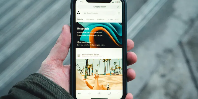
If you have ever pulled up a website on your phone and had to pinch, zoom, and scroll sideways just to read it, you have experienced what happens when mobile is an afterthought. It is frustrating as a visitor, and for the business behind that site, it is costing them customers. Mobile-first web design is the approach that prevents that from happening, and for any small business looking for a responsive web design service today, it is not optional.
What Mobile-First Actually Means
Mobile-first is exactly what it sounds like. When a developer builds a site with a mobile-first approach, they start by designing and coding for the smallest screen first, typically a smartphone, and then scale up to larger screens like tablets and desktops from there.
This is the opposite of how websites used to be built. The old approach was to design for a desktop screen and then try to squeeze everything down to fit a phone afterward. That process almost always produced a compromised mobile experience because the layout was never intended for a small screen in the first place.
Starting with mobile forces every decision to be made with the smallest and most constrained version of the site in mind. Navigation, text size, button placement, image sizing, all of it gets figured out for mobile first. When that foundation is solid, scaling up to desktop is straightforward. When it is not, no amount of adjustments after the fact fully fixes it.
Why It Matters for Your Business
More than half of all web traffic today comes from mobile devices. For local service businesses specifically, that number tends to be even higher because people searching for a plumber, an HVAC company, or a cleaning service are often doing it from their phone in the moment they need help.
If your site is difficult to use on a phone, those visitors leave. And they do not come back. They find the next result on Google and call that business instead. A poor mobile experience does not just frustrate visitors, it sends them directly to your competitors.
Google Looks at Your Mobile Site First
Here is something that surprises a lot of business owners. Google does not primarily evaluate the desktop version of your site when deciding how to rank it. It uses mobile-first indexing, which means it crawls and evaluates the mobile version of your site first. That is the version it bases your ranking on.
What that means in practice is that a site that looks great on a desktop but performs poorly on mobile is going to struggle in search results. It does not matter how well optimized the desktop version is. If the mobile experience is slow, hard to navigate, or missing content, Google sees that and ranks accordingly.
For a local service business trying to show up when someone in Tampa searches for what you do, mobile performance is directly tied to whether you get found at all.
What a Poor Mobile Experience Looks Like
It helps to be specific about what actually goes wrong when a site is not built with mobile in mind.
Text that is too small to read without zooming in is one of the most common issues. Buttons and links that are placed too close together, making it easy to tap the wrong one, is another. Content that runs off the edge of the screen, requiring horizontal scrolling, is a sign that the layout was not built for small screens. Images that take forever to load on a mobile connection slow the whole experience down. Navigation menus that work fine with a mouse but become unusable with a thumb are another problem that shows up constantly on sites that were not designed with mobile in mind.
Any one of these issues is enough to make a visitor leave. Most sites that were not built mobile-first have several of them at once.
What a Responsive Web Design Service Does Differently
Website builders and templates handle mobile responsiveness automatically, which sounds convenient but comes with real limitations. The template was designed to work across a range of screen sizes in a general way, not for your specific content and layout. The result is often functional but rarely optimized. Things fit on the screen, but they do not necessarily look right or work intuitively.
Working with a responsive web design agency that hand-codes every site means your mobile experience is not an afterthought bolted onto a desktop layout, it is built into the foundation from day one.
Before a single line of code gets written, there are conversations about your business, your customers, and what people need to be able to do when they land on your site from their phone. Those conversations shape how the mobile experience gets built, not as an afterthought, but as the foundation. Every element gets coded with intention. Text sizes, spacing, button sizes, image handling, navigation, all of it gets thought through for a small screen first and then built out from there. The result is a mobile experience that feels natural because it was designed that way from the beginning, not adjusted after the fact to fit a screen it was never meant for.
The Bottom Line
Mobile-first web design is not a feature or an add-on. It is the standard for how websites should be built in 2026. Most of your potential customers are going to find you on their phone, and Google is going to rank you based on how your site performs on that phone. A site that was not built with mobile as the priority is working against you on both fronts.
For a Tampa Bay service business trying to get found online and turn visitors into customers, a mobile-first hand-coded site is one of the most important investments you can make.
Work with a Mobile First Web Designer
Here at Bay Breeze Web Studio we priortize mobile-first web design. We start from the ground up to get your website hit the ground running. Doing so ensures you get the best results day one and keep customers happy by providing them a positive website experience.
Let's get started on your mobile-first web design. Contact us today to book a discovery call!